You’ve seen the Lay’s logo a thousand times: yellow background, a splash of red, a floating ribbon, the name smack in the middle. It’s classic, iconic, and everywhere—from grocery stores to vending machines. But here’s the kicker: there’s a subtle design detail most people completely miss.
Lay’s has been around since 1932, named after the real person Herman Lay, and over the decades it’s grown into a global snack empire. Everyone knows the chips are addictive, but the logo? That’s where it gets sneaky. It’s not just a cheerful badge—it quietly nods to its parent company, Frito-Lay.

Did You Even Notice This?
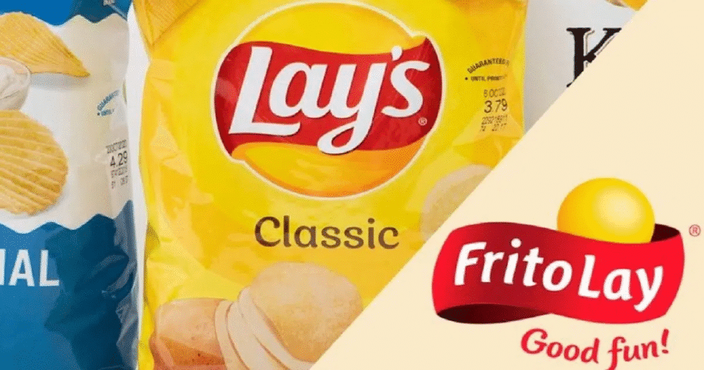
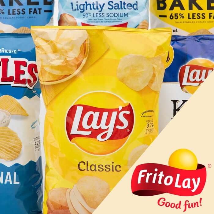
Take a closer look at the yellow orb in the Lay’s logo. It’s not just decoration. That round, sunny shape mirrors the golden ball in the Frito-Lay logo—a puffy, 3D sun or chip, depending on how you see it. Frito-Lay’s branding also features a swooping red banner and a “Good Fun!” tagline. Lay’s strips it down to the essentials: yellow circle, red swoosh, white letters. Subtle, but unmistakably a nod to the parent brand.
This isn’t some hidden symbol—it’s branding continuity done cleverly. You may not consciously notice it, but your brain absorbs the visual cue: red and yellow, round and sunny, fun and fresh. That’s Lay’s quietly reminding you where it comes from without plastering “By Frito-Lay” across the bag.

Why the Sun? Why Not a Potato?
There’s a reason the logo uses a sun shape instead of, say, a potato. It conveys warmth, freshness, and vitality. The bright yellow circle evokes a just-fried, crispy, golden chip vibe. It’s not about literal reality; it’s about emotion. The sun says: “We’re fun, fresh, and ready to crunch!”
The color combo matters too. Yellow triggers appetite and cheerfulness, while red grabs attention and stimulates emotion. Together, they’re snack aisle magnets—half the products around you use these same colors for a reason.
Next time you grab a bag of Lay’s—Classic, Sour Cream & Onion, whatever—take a minute to stare at the logo. That yellow orb, the red swoosh, the subtle nod to Frito-Lay—it’s all there. You might be ripping open the bag, but your brain is soaking up this little design Easter egg, decades in the making.
