I still remember the first time someone told me the second “C” in the Coca-Cola logo looks like a smile. At first, I brushed it off. But once you notice it, it’s impossible to unsee. Suddenly, the flowing curves of that classic red-and-white script feel cheerful, warm, and almost expressive. Some people now believe the logo carries a subtle emotional tone — friendly, joyful, even welcoming. That got me thinking: is this a clever hidden design choice, or are we simply projecting meaning onto a familiar symbol?
What People Are Seeing
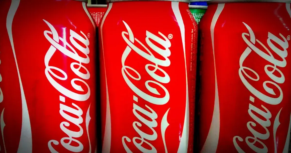
If you look closely at the vintage Coca-Cola wordmark, you’ll notice something interesting about the second “C” in “Cola.” The top curve stretches outward a bit more than expected, then swoops back under — a shape that closely resembles a smiling mouth. Tilt it slightly in your mind, and it can easily read as a grin.

Many people now interpret that curved flourish as a friendly visual cue — like the logo itself is smiling back at you. Some even describe it as a playful wink hiding in plain sight. Once that idea takes root, it sticks, much like spotting a face in the clouds or shapes in shadows.
What History Actually Confirms
Here’s what we know for certain: the Coca-Cola logo’s famous cursive lettering dates back to the late 1880s. The name and script were designed by Frank Mason Robinson, who chose a popular Spencerian handwriting style of the era — elegant, flowing, and decorative.
The curves and flourishes weren’t intended as clever symbolism; they simply reflected the fashionable writing style of the time. Elements like the red background and the iconic ribbon design came much later, as branding evolved in the 20th century.
There is no historical record — no design notes, company memos, or vintage advertising — suggesting that the second “C” was meant to represent a smile. No documented intent, no official acknowledgment, and no early branding references support that idea.
Was the “Smile” Ever Intentional?
In short: there’s no credible evidence that the smile was planned. No archived materials, no early design briefs, and no classic ads point to a hidden emotional message in that letter.
The idea of a smiling “C” appears to be a modern interpretation — something that resurfaced as people began re-examining classic logos with fresh cultural perspectives and a growing interest in hidden symbolism. While many viewers now see a grin, there’s no proof the original designers ever intended it.
Why the Idea Feels So Believable
Even without historical confirmation, it’s easy to understand why people see a smile in the logo today. The human brain is wired to detect patterns — especially faces and emotional cues — a psychological effect often linked to pareidolia. Once someone suggests the idea, our minds naturally latch onto it.

It also fits perfectly with Coca-Cola’s brand identity. For decades, the company has promoted happiness, nostalgia, refreshment, and connection. A smiling curve in the logo feels like a natural extension of those values — even if that meaning developed long after the design itself.
There’s also something poetic about how interpretations evolve. A decorative flourish from 1886 can take on new emotional meaning in 2025. As culture changes, so does the way we interpret familiar visuals. Over time, designs grow beyond their original purpose and collect new stories, feelings, and symbolism.
So… Is the Smile Really There?
Whether the second “C” was ever meant to be a smile doesn’t change the fact that many people see one now — and that says a lot about how branding works. Logos don’t just live on paper; they live in perception, memory, and emotion.
I like to think of that curve as a quiet visual handshake — a subtle gesture of warmth, friendliness, and familiarity. Some might call it projection, others retroactive meaning. But almost everyone agrees on one thing: once you see that “smile,” you’ll notice it every single time.
Rather than assuming every design hides a secret message, it’s more meaningful to appreciate how logos evolve in our minds over time. The Coca-Cola logo started as ink on paper — and over generations, it has become part of cultural memory, emotion, and identity. That transformation is what truly makes it iconic.