Starbucks. My go-to morning ritual, my little caffeine pick-me-up, and the trusty companion for countless early mornings. That iconic cup in my hand has seen it all—but here’s a fun fact: the Starbucks logo hides a tiny secret that most people completely overlook. I was just as surprised when I found out!
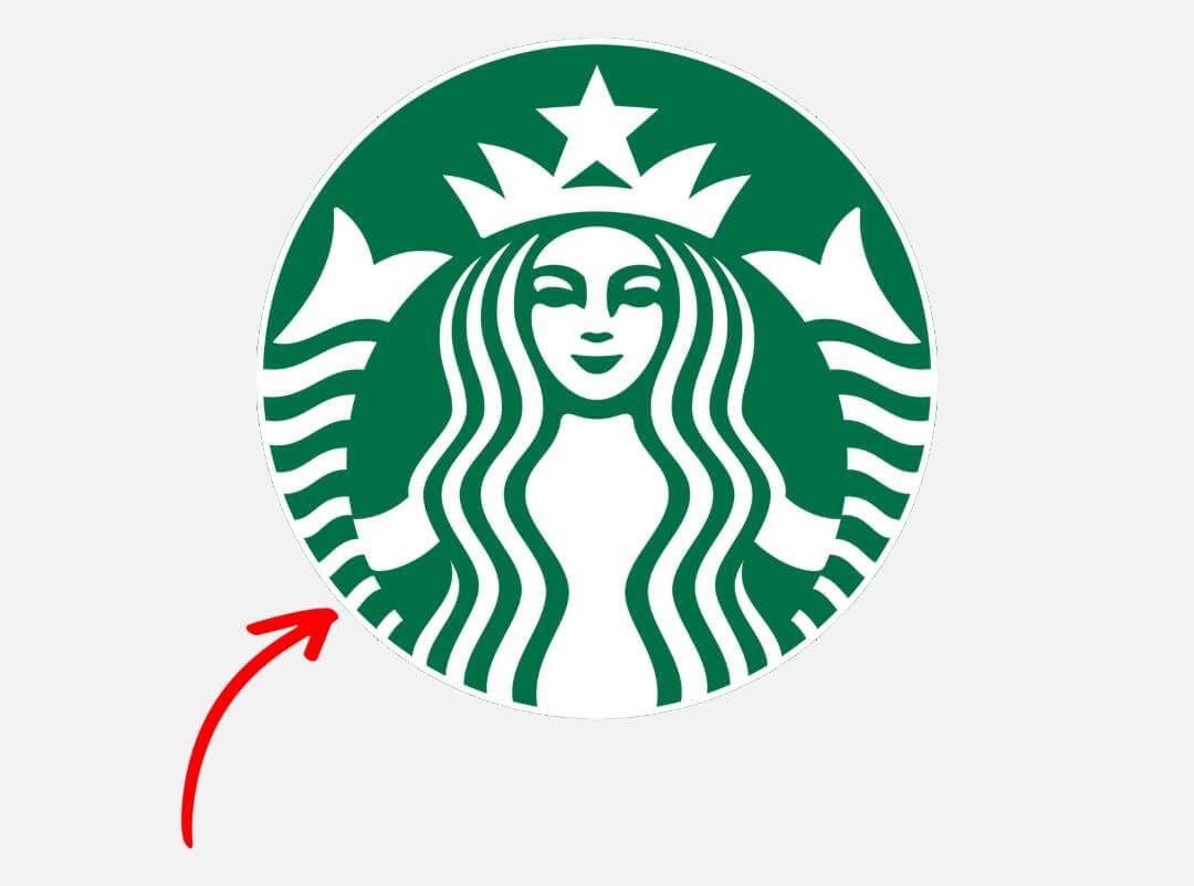
Before we dive into the secret, let’s take a quick sip of history. At the center of every Starbucks cup is a siren, a mythical sea figure reminiscent of tales like Moby Dick. In fact, the Starbucks name itself is a nod to this classic nautical story.
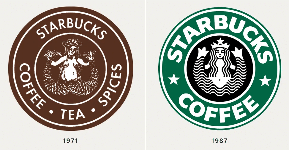
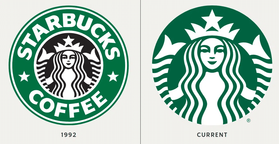
The logo has evolved quite a bit over the years. It started out brown, then switched to the now-famous green in 1987. When Starbucks went public in 1992, the logo got a sleek, modern facelift. But the real transformation came in 2011, when “Starbucks Coffee” was removed from the design, leaving the siren front and center—more symmetrical, more captivating, and a little mysterious.
Here’s the hidden gem: if you look closely, the siren’s face isn’t perfectly symmetrical. The right side is slightly more shadowed than the left. Her nose dips subtly on the right, and her right eye seems to hide just a bit behind the bridge of her nose. These tiny touches were intentional, designed to add a human-like imperfection, making her feel warmer and more relatable.
It’s these small, easily missed details that make the Starbucks experience feel so special. Next time you cradle that cup of latte or cappuccino, take a second look at the siren. She’s not just a logo—she’s a tiny secret woven into your daily coffee ritual, a little story hiding in plain sight.
Who knew your morning coffee run could come with such a fascinating hidden detail?