I’ll be honest—I’m a sucker for a good fast food meal. I don’t hit the drive-thru every day, but when I do, there’s something comforting about grabbing a burger and fries from a favorite chain. Wendy’s is definitely one of those go-to spots for me.
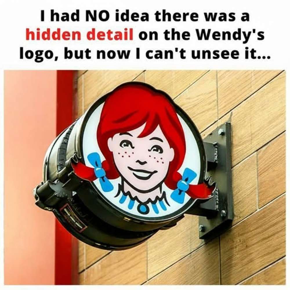
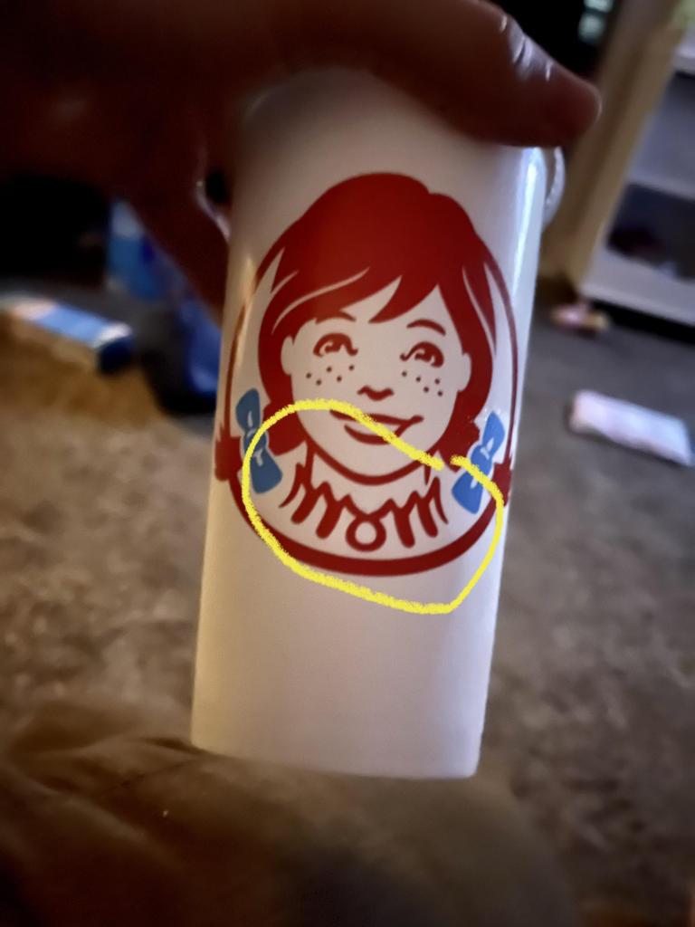
You probably recognize the Wendy’s logo right away: a smiling red-haired girl with freckles and blue bows at the ends of her pigtails. But did you know there’s a tiny hidden detail tucked into that familiar image? Wendy’s was named after founder Dave Thomas’s daughter, Wendy. However, he also decided to pay tribute to another family member in the design. If you look carefully at Wendy’s ruffled collar, you’ll notice the word “MOM” cleverly incorporated.
Fast food logos aren’t the only ones with secret touches. Take Subway, for example—the arrows at each end of its logo symbolize the entrance and exit of a subway train. And Toblerone, the Swiss chocolate company, has a subtle nod to its hometown: if you examine the mountain in the logo closely, you might spot a hidden bear representing Bern, Switzerland.
It’s fascinating how brands sneak little Easter eggs into their logos, right? Honestly, all this talk about burgers, sandwiches, and chocolate has me craving a Wendy’s run—who’s with me?